

Colour Theory in Fashion: Wear Colours That Work
TL;DR
Most people pick colours by gut feeling — and wonder why some outfits just don't land. Colour theory in fashion finally explains why, and agentic AI is making it personal. This guide breaks down everything from the colour wheel to skin undertones, psychological colour signals, and how intelligent multi-agent systems are translating abstract theory into outfits built specifically for you.
Why Getting Colour Right Is Harder Than It Looks
You've been there. You're in a dressing room holding up a sweater that looked perfect on the rack — right size, right style. But the moment you hold it up to your face, something feels off. You put it back. You leave empty-handed.
This happens to millions of Americans every single day. And it's not a taste problem. It's a colour knowledge problem.
Global fashion e-commerce sales totalled $821.1 billion in 2024 and are expected to reach $1.16 trillion by 2030 — which means more options, more choices, and more decisions about colour than any previous generation has ever had to make. And most of us are making those decisions without any real framework.
Colour theory in fashion is one of those subjects that sounds like it belongs in a design school classroom. But understanding even the basics — the colour wheel, undertones, complementary versus analogous pairings — can genuinely change how you get dressed. It helps you stop buying things that don't work, build a wardrobe that actually coheres, and walk out the door looking intentional rather than accidental.
What makes this moment especially interesting: the gap between understanding colour theory in fashion and applying it to your actual face, body, and lifestyle is finally starting to close — thanks to agentic AI systems that translate abstract colour principles into real, personalized recommendations. This guide covers both.
The Foundations: What Colour Theory in Fashion Actually Is
Colour theory in fashion is the application of scientific and artistic principles about how colours relate to each other — applied to clothing, styling, and personal presentation. It borrows from visual art (where it began with Sir Isaac Newton's colour wheel experiments) and maps those rules onto how fabrics, skin tones, hair, and environments interact.
At its core, the colour wheel organizes colours into relationships: primary colours (red, yellow, blue), secondary colours (orange, green, violet), and tertiary colours (the in-betweens). From these relationships, stylists and designers build strategic colour combinations.
The three most commonly used colour schemes in fashion:
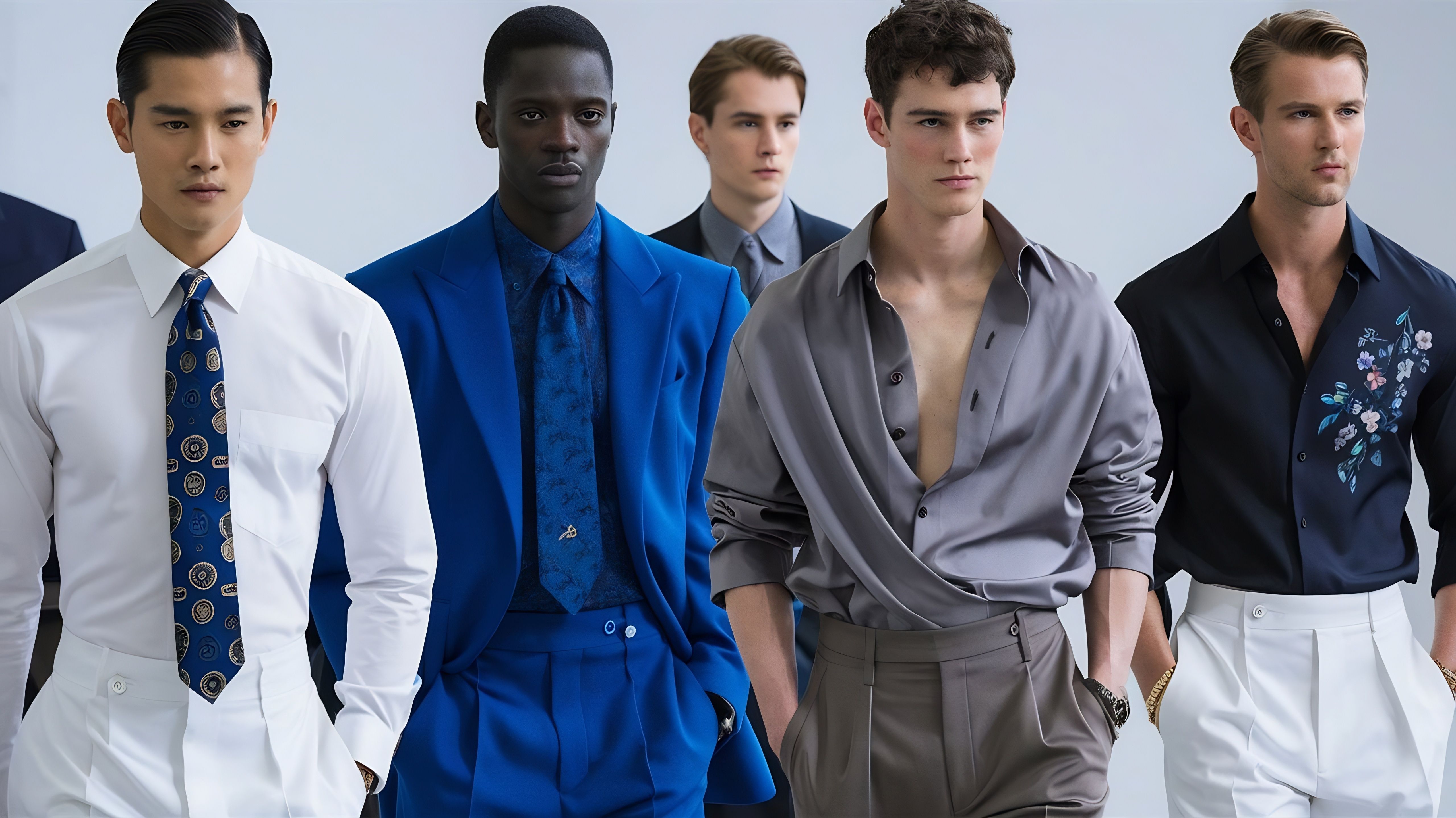
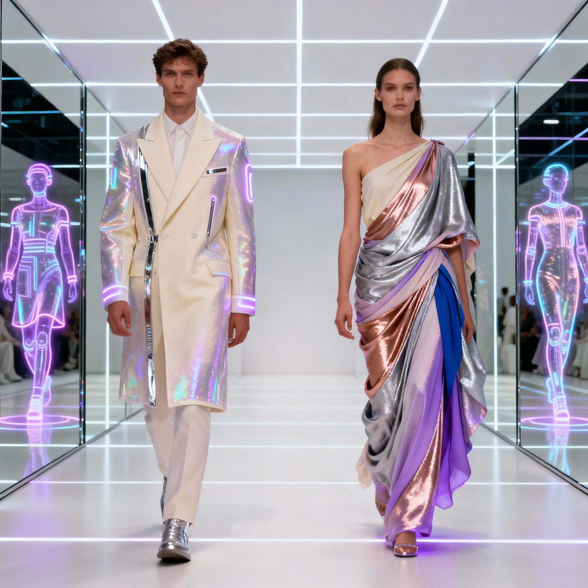
Complementary colours sit directly opposite each other on the wheel — red and green, blue and orange, purple and yellow. Worn together, they create high visual contrast and bold, attention-holding outfits. A cobalt blue blazer with burnt orange trousers is striking because your eyes are literally wired to find that contrast interesting.
Analogous colours are neighbours on the wheel — blues, blue-greens, and greens, for example. These combinations feel harmonious, calm, and cohesive. An analogous outfit rarely wows a room, but it almost never looks off either.
Monochromatic styling uses different shades, tints, and tones of a single colour. An all-camel outfit, varying depths of navy, a head-to-toe grey look — these work because visual continuity reads as intentional. Varying texture within a monochromatic look is the key move: a matte knit, a silk shirt, and a patent leather bag in the same shade of cream reads as dimensional rather than uniform.
Beyond combinations, colour theory in fashion also covers colour temperature (warm versus cool), value (light versus dark), and saturation (vivid versus muted). These dimensions interact directly with your personal colouring — specifically, your skin undertone.
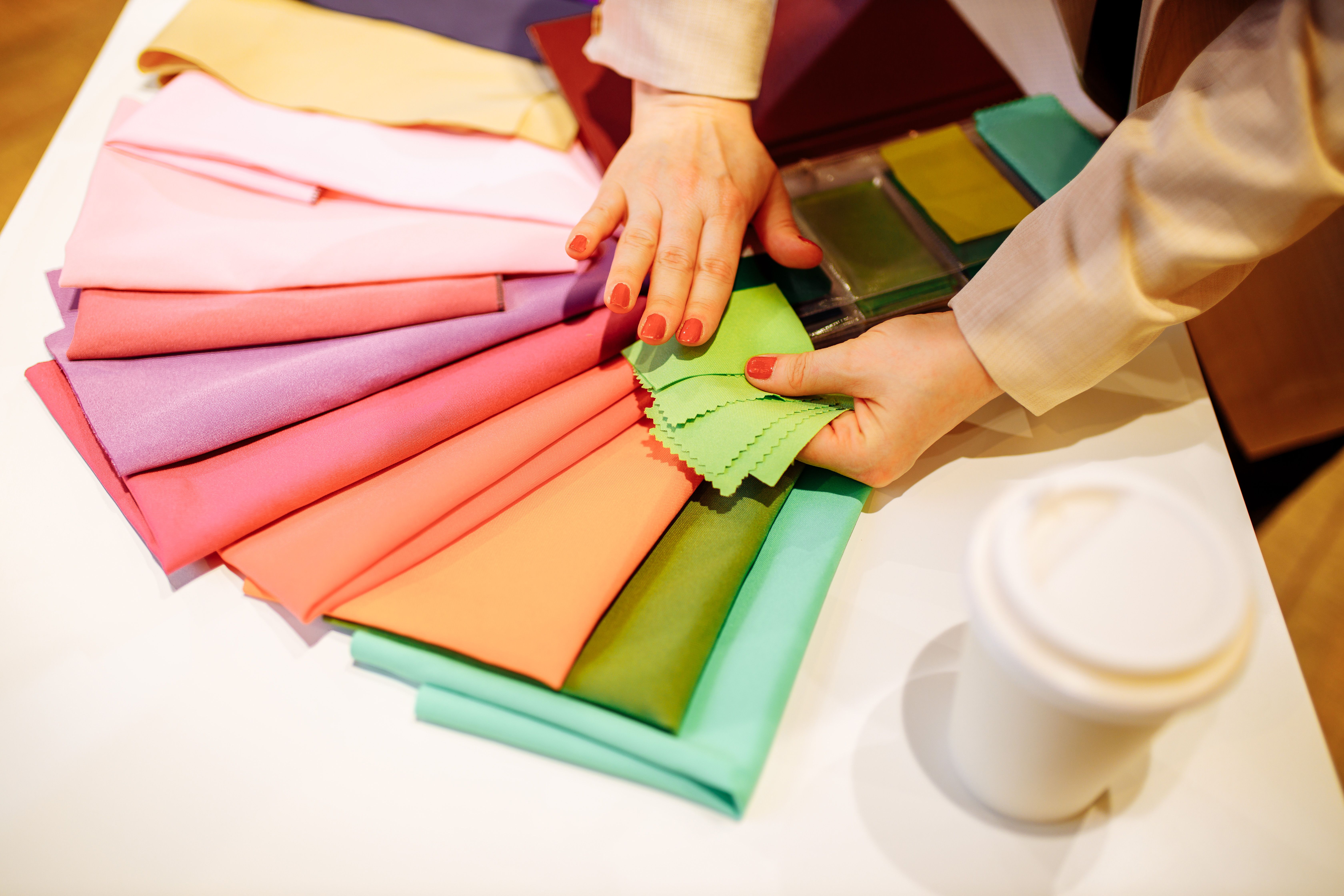
Skin Undertones: The Variable That Changes Everything
Here's where colour theory in fashion stops being abstract and starts being personal.
The reason a particular shade of yellow makes one person glow and makes another look like they have the flu isn't random. It comes down to skin undertone — the subtle hue that sits beneath the surface of your skin and influences how your complexion appears under different lighting.
There are three broad categories:
Warm undertones carry golden, peach, or bronze hues beneath the surface. If you look at your inner wrist and your veins appear greenish, and if gold jewellery tends to look natural on you, you're likely warm-toned.
Cool undertones carry pink, rosy, or bluish hues beneath the surface. Blue or purple veins, and silver jewellery looking more natural on you, are reliable indicators.
Neutral undertones sit balanced between warm and cool — both silver and gold work, and your skin doesn't lean obviously in either direction.
The practical implication is significant. People with warm undertones tend to look most vibrant in earthy, golden tones: amber, terracotta, warm olive, camel, coral, warm reds, and cream. People with cool undertones tend to glow in jewel tones: emerald, cobalt, burgundy, rose, slate. Neutral undertones are genuinely flexible and can navigate a wider range of the spectrum with fewer pitfalls.
Beyond undertone, your depth of colouring matters too. Seasonal colour analysis — popularized in the 1980s and still widely used — groups people into four types (Spring, Summer, Autumn, Winter) based on the combination of undertone and depth of natural colouring. A "Winter" type (cool undertone, deeper colouring) typically thrives in high-contrast, crisp colours. A "Spring" type (warm undertone, lighter colouring) tends to suit clear, fresh, warm hues. Understanding your seasonal palette is essentially a shorthand for navigating thousands of colour theory in fashion decisions at once.
The Colour Wheel in Practice: Building Outfits That Work
Knowing that complementary colours sit opposite each other on the wheel is useful. Knowing how to use that in your actual closet is more useful.
Complementary Pairings: Bold Without Being Chaotic
The most common mistake with complementary pairings is going too saturated with both colours at once. The key is balance: when one piece is vivid (a bright cobalt blue top), the complementary piece (orange trousers or an orange bag) should be more muted, or used in smaller proportion. Navy and terracotta, forest green and burgundy, soft purple with warm yellow — these hold up across a wide range of personal colourings.
Analogous Pairings: The Easiest Route to Polished
Analogous outfits are what stylists reach for when they want someone to look put-together without trying too hard. A camel coat over a rust sweater with brown trousers. A dusty pink blouse with mauve trousers and rose accessories. These feel effortless because the human eye reads the harmony as intentional.
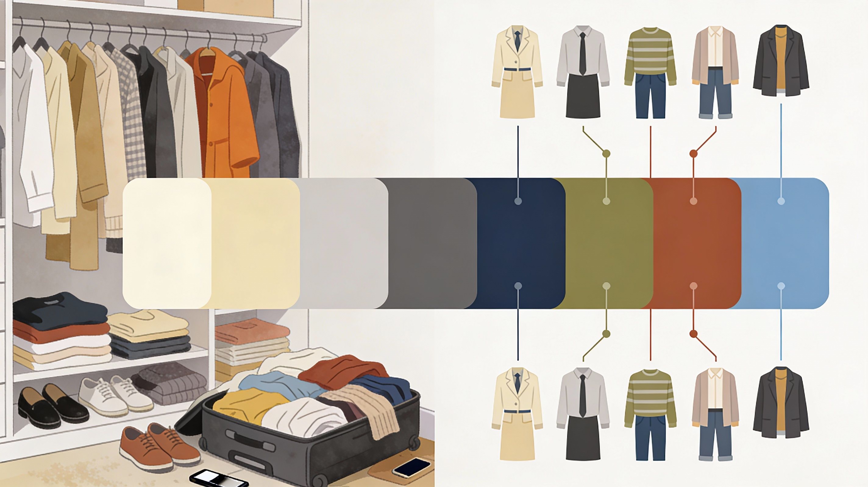
Neutrals as the Foundation
Every functional colour wardrobe needs a foundation of neutrals — black, white, grey, navy, camel, tan, and brown. These pair with almost anything on the wheel, which is why building around a core of neutrals makes every subsequent colour decision significantly easier. From there, you introduce accent colours that work with your undertone, and everything becomes more navigable.
Why Colour Decisions Are Still Hard (Even With All This Knowledge)
If colour theory in fashion has been around this long, why do so many people still struggle to dress in colours that actually work for them?
The answer has a few layers.
First, there's the translation problem. Knowing you're warm-toned doesn't automatically tell you whether this particular mustard works with your specific depth of colouring, your hair at this length, and the lighting of the event you're dressing for. Theory gives you a map. Application requires judgment.
Second, there's the colour accuracy problem in online shopping. Research has found that as online fashion purchases increase, the problem of inaccurate colour representation becomes more significant — colour inaccuracy leads to lost sales, increased returns, and customers who won't come back to an e-tailer after receiving items in colours different from what they expected.
And third, colour theory in fashion has historically been taught through a relatively narrow range of skin tones. Many people received the message — consciously or not — that these systems weren't designed with them in mind.
This last point is one of the most important, and one that AI is beginning to address directly.
How Agentic AI Is Closing the Gap Between Theory and Reality
Here's where it gets genuinely interesting.
Agentic AI refers to systems that don't just respond to prompts — they proactively coordinate multiple intelligent processes to accomplish a goal. In fashion, that means deploying several specialized agents simultaneously: one analyzing your physical attributes, one tracking current colour trends, one factoring in weather and context, one learning from your behavioural signals over time.
Shopping-related searches on generative AI platforms grew 4,700 percent between 2024 and 2025, according to the McKinsey and BoF State of Fashion 2026 report. That's not a minor trend — it signals that people are actively seeking a smarter way to navigate fashion decisions, including colour decisions.
What makes agentic AI different from a standard style recommendation tool is the ability to hold multiple variables simultaneously. Consider what a genuinely good colour theory in fashion recommendation for a real person actually requires:
- Their skin undertone and depth of colouring
- Their hair colour and natural contrast
- The season and local climate
- Current colour trends and what's actually available to shop
- The occasion they're dressing for
- Their personal style history and preferences
No single agent handles all of this alone. But a multi-agent system — each one specializing in a different dimension and feeding into a coordinated output — can hold all those variables at once and generate styling recommendations that feel genuinely personal.
The global AI in fashion market was valued at $2.23 billion in 2024, projected to reach $60 billion by 2034, growing at a 39% CAGR. That growth reflects real demand for more intelligent, personalized fashion experiences — not just more product listings.
Platforms like Glance are building exactly this kind of multi-agent architecture into the discovery experience. When a user shares a selfie and their location, the system analyzes physical attributes including skin tone, undertone, face shape, and hair colour — cross-referencing those against seasonal colour trends and live shoppable inventory — and surfaces complete styled looks that are colour-matched to who that person actually is. It's a shift from "here are 4,000 results for blue tops" to "here is a curated collection of looks that work with your colouring, your context, and what you've responded to before."
That is colour theory in fashion — at scale, personalized, and actually executable.
Colour Psychology: The Emotional Dimension You Can't Ignore
Colour theory in fashion isn't purely visual. It's also psychological — and understanding this dimension adds a meaningful layer to how you can use colour intentionally.
Research suggests that 85% of buyers say colour is the primary factor in their decision to select one product over another. That statistic is about consumer products broadly, but it reflects something true about personal style too: colour communicates before you say anything.
Different colours carry consistent psychological associations:
Red signals energy, confidence, and intensity. In professional contexts, it reads as authoritative. In social settings, it tends to command attention.
Blue is the most broadly trusted colour across cultures — associated with calm, reliability, and competence. Navy in particular is one of the most versatile pieces in fashion precisely because it signals thoughtfulness without trying too hard.
Yellow and orange communicate warmth, optimism, and approachability. They're genuinely mood-lifting to wear, and they project openness. The challenge is calibration against your personal colouring — a warm golden yellow that glows against your skin is a very different garment from a cool lemon yellow that doesn't.
Neutrals — black, white, grey, camel, navy — create space for other elements to lead. They're not emotionally flat; black carries different energy than ivory, and charcoal reads differently than pure white. But they're versatile anchors that work across contexts.
Cultural context matters here too. Cultural fusion palettes are gaining traction across lifestyle and personal care brands — turmeric yellow, deep burgundy, rich indigo, and warm spice tones — telling stories of global culture, heritage, and individuality in ways that feel both contemporary and rooted. The best colour choices aren't just technically correct. They're expressive.
Colour Theory in Fashion Across Life Stages and Contexts
Colour theory in fashion applies differently depending on where you are in life and what you're dressing for. The same framework serves you at every stage — the application evolves.
For everyday dressing: Build around the neutrals that work for your undertone. Warm-toned people often find ivory, camel, warm brown, and olive-grey work better than crisp white and cool grey. Cool-toned people often find true navy, charcoal, and pure white work better than off-white and tan. Add two or three accent colours from your best palette. That's your personal colour system.
For professional settings: Deep, cool neutrals (navy, charcoal, slate) read most universally as authoritative. Brighter or warmer accent colours work well as layering pieces or accessories. The goal is intentional contrast — looking like you thought about it.
For social occasions: This is where you can take more risks. Complementary pairings that feel too bold for the office can become the most memorable thing about an outfit at a party. The confidence that comes from wearing colour intentionally — not just hopefully — is visible.
Across generations: In 2025, 70% of online shoppers say they were inspired to buy clothing via social media. Younger shoppers often encounter colour theory through trends first — Barbiecore pink, coastal grandmother neutrals, quiet luxury off-whites — and personal colouring second. The opportunity is layering personal colour knowledge on top of trend awareness: not just what's popular but what works for me specifically. For Gen X and Boomer shoppers with more colour theory background, the challenge is often the reverse — the knowledge exists, but applying it in a fast-moving, option-heavy digital environment is harder without support.
This is exactly where agentic AI becomes most useful — not replacing the knowledge people already have, but scaling the application of it across every shopping moment.
A Practical Colour Theory Framework You Can Use Today
Here's a framework that synthesizes everything above — applicable whether you're shopping online, cleaning out your closet, or just getting dressed:
Step 1: Know your undertone. If you don't know yours, the vein test (green = warm, blue/purple = cool) and the white paper test (yellowish skin = warm, pinkish = cool) are reliable starting points.
Step 2: Identify your anchor colours. Think about colours you've worn in the past and received genuine, unsolicited compliments in. These are your personal palette — build around them.
Step 3: Choose your neutrals intentionally. Based on your undertone, select the neutrals that actually work for you, not the default ones. This eliminates enormous wardrobe friction.
Step 4: Add accent colours from complementary or analogous pairings. One bold, seasonally relevant accent colour per season is manageable. Two is interesting. Three risks fragmenting your wardrobe.
Step 5: Let context and psychology guide application. The same colour works differently depending on occasion, season, and what you want to communicate. Use that intentionally.
Step 6: Use available tools. Whether that's a colour analysis consultation, a digital styling platform, or an agentic AI system that learns your preferences over time — the technology exists to make this less effortful and more accurate.
Conclusion: Colour Theory Is Personal — And It's Finally Getting Treated That Way
Colour theory in fashion has always been a powerful framework. The challenge has always been application — bridging the gap between understanding the colour wheel and the practical reality of choosing what to wear on any given day, with any given skin tone, in any given season.
That gap is genuinely closing — not because colour theory has changed, but because the tools available to apply it have gotten dramatically smarter.
Agentic AI doesn't replace the creative act of getting dressed. It replaces the cognitive overhead of doing it poorly. When a system can understand your undertone, synthesize colour trends, factor in your context, and surface complete personalized looks in real time, the knowledge becomes practical rather than theoretical. The concept becomes executable.
For anyone who has ever stood in a dressing room knowing something was off but not being able to say why — that's a meaningful shift.
Frequently Asked Questions
- What is colour theory in fashion and why does it matter?
Colour theory in fashion is the practical application of colour science — the colour wheel, undertones, and colour relationships — to personal styling and outfit building. It matters because colour is one of the most powerful variables in how you're perceived and how you feel. Wearing colours that work with your skin tone and the occasion you're dressing for creates visual harmony that's noticeable even when nobody can articulate exactly why. - How do I figure out my skin undertone for choosing fashion colours?
The most reliable methods are the vein test (green veins suggest warm undertones; blue or purple suggest cool) and the white paper test (hold white paper near your face in natural light — yellowish or peachy skin suggests warm undertones; pink or blueish suggests cool). Your instinctive preference for gold versus silver jewellery is also a useful indicator. - What's the difference between complementary and analogous colour combinations? Complementary colours sit opposite each other on the colour wheel (like blue and orange) and create high visual contrast — bold, striking, and eye-catching. Analogous colours are neighbours on the wheel (like blue, blue-green, and green) and create harmonious, cohesive outfits that feel naturally pulled-together. Neither approach is better — they serve different intentions and moods.
- How does agentic AI apply colour theory in fashion?
Agentic AI uses multiple specialized systems working at once — analyzing your physical attributes like skin tone and undertone, factoring in seasonal trends, weather, and personal style history — to surface colour-matched outfit recommendations. Unlike a single recommendation engine, it synthesizes several streams of context simultaneously, applying colour theory principles in a way that's specific to your appearance, your location, and your moment. - Can colour theory in fashion work for all skin tones?
Yes — and that's one of its most important functions. Colour theory isn't about prescribing flattering colours based on a narrow standard. It's about understanding how any skin tone interacts with colour temperature, value, and saturation. Every undertone has a rich palette available to it. The key is matching those variables to your actual complexion, not a default or idealized standard. - What colours should I start with if I have no idea where to begin?
Start with what stylists call universal colours — navy, warm white or ivory, teal, deep purple, warm pink, and charcoal. These have balanced warm and cool characteristics and tend to work across a wide range of undertones. From there, use the vein or paper test to identify your undertone and refine from there. Even knowing whether you're warm or cool cuts the decision space significantly. - Is colour psychology in fashion actually real, or is it just marketing?
It's real and well-documented. Colour influences emotional response, perception, and even behaviour in measurable ways. The psychological associations — red for energy and confidence, blue for calm and trust, yellow for warmth and approachability — are consistent enough across cultures to be genuinely useful as a styling tool. Colour communicates something about you before you've said a single word.
Download the Glance app now


