

Fashion Color Psychology Guide: How It Impacts
TL;DR
Color in fashion is not just about what it represents. It is about what decision it drives. Most people understand what colors mean, but struggle with when and how to apply them. This gap between knowledge and action is where intelligent systems step in. The Glance Intelligent Shopping Agent translates color psychology into real outfit decisions by combining mood, context, personal attributes, and wardrobe patterns. Instead of guessing what works, you get precise, situation aware outfit suggestions that reduce decision fatigue and improve confidence.
Before you introduce yourself, your outfit has already created a perception. Color is the first signal in that interaction. It shapes how others read your intent, your energy, and your confidence.
A recruiter forms an opinion within seconds.
A client interprets reliability before a word is spoken.
A date reads emotional cues without consciously analyzing them.
Color is not just visual. It is behavioral. It influences perception and it influences how you carry yourself.
But here is the real problem.
Most people know what colors mean. Very few know how to use them correctly in real situations.
This is where fashion advice typically fails. It informs, but it does not assist.
So, here is for you, a complete fashion color psychology guide.
Importance of Color Psychology in Fashion
Modern fashion is no longer just about trends. It is about alignment.
People want outfits that reflect how they feel and how they want to be perceived. This is especially true for Gen Z and younger professionals who use clothing as a form of identity and expression.
Color plays a central role in this shift.
It influences:
- First impressions
- Emotional perception
- Confidence levels
- Social and professional interactions
What makes it even more relevant today is context.
You are no longer dressing for one environment. You move between spaces. Work, social settings, travel, digital presence. Each demands a slightly different version of you.
Color helps you navigate that shift without changing your entire wardrobe.
Did you know? In the mid 20th century, Suzanne Caygill introduced the Caygill Method of Color Analysis, a pioneering approach that linked individual color palettes to personal style, skin tone, and overall visual harmony.
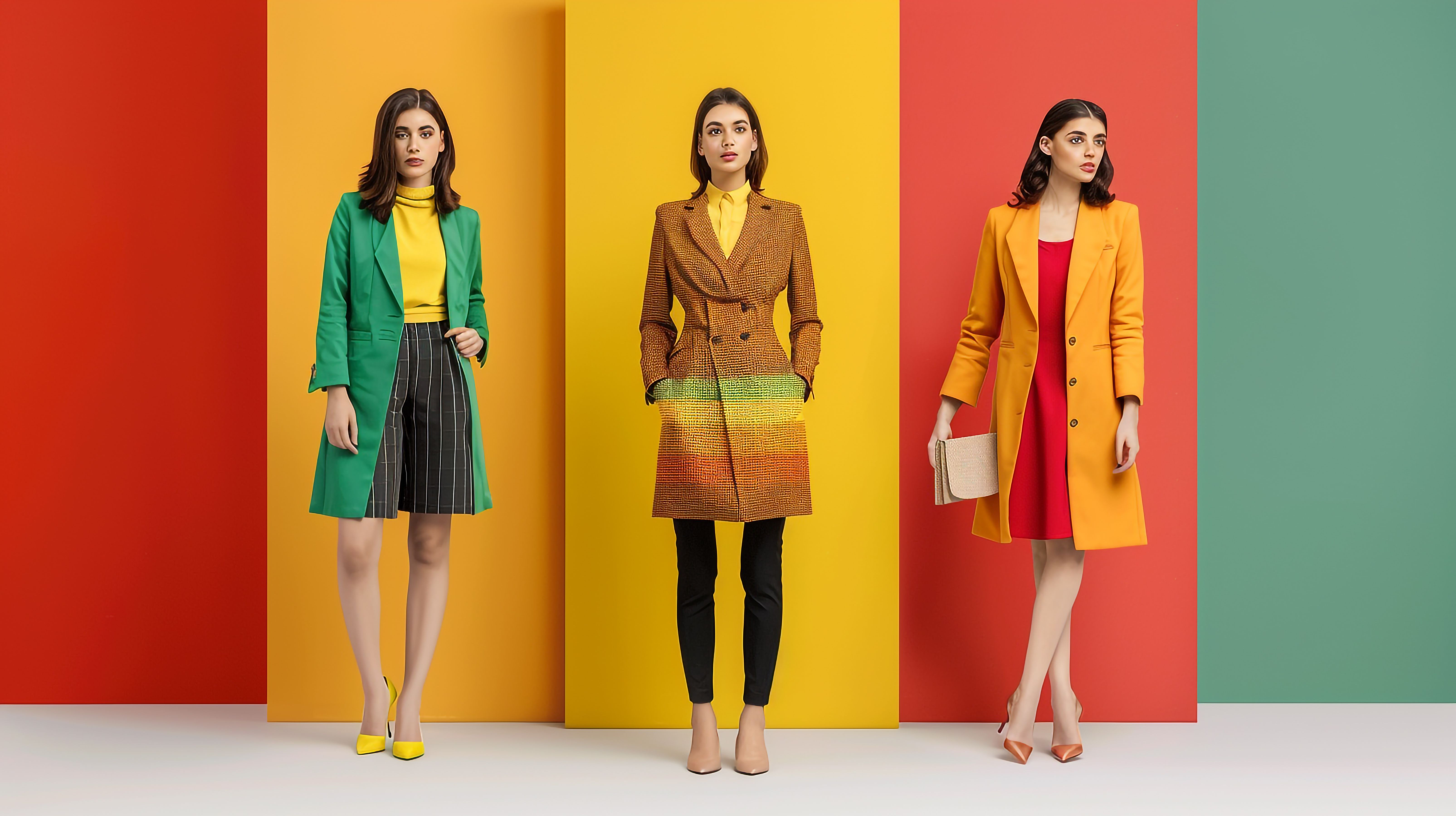
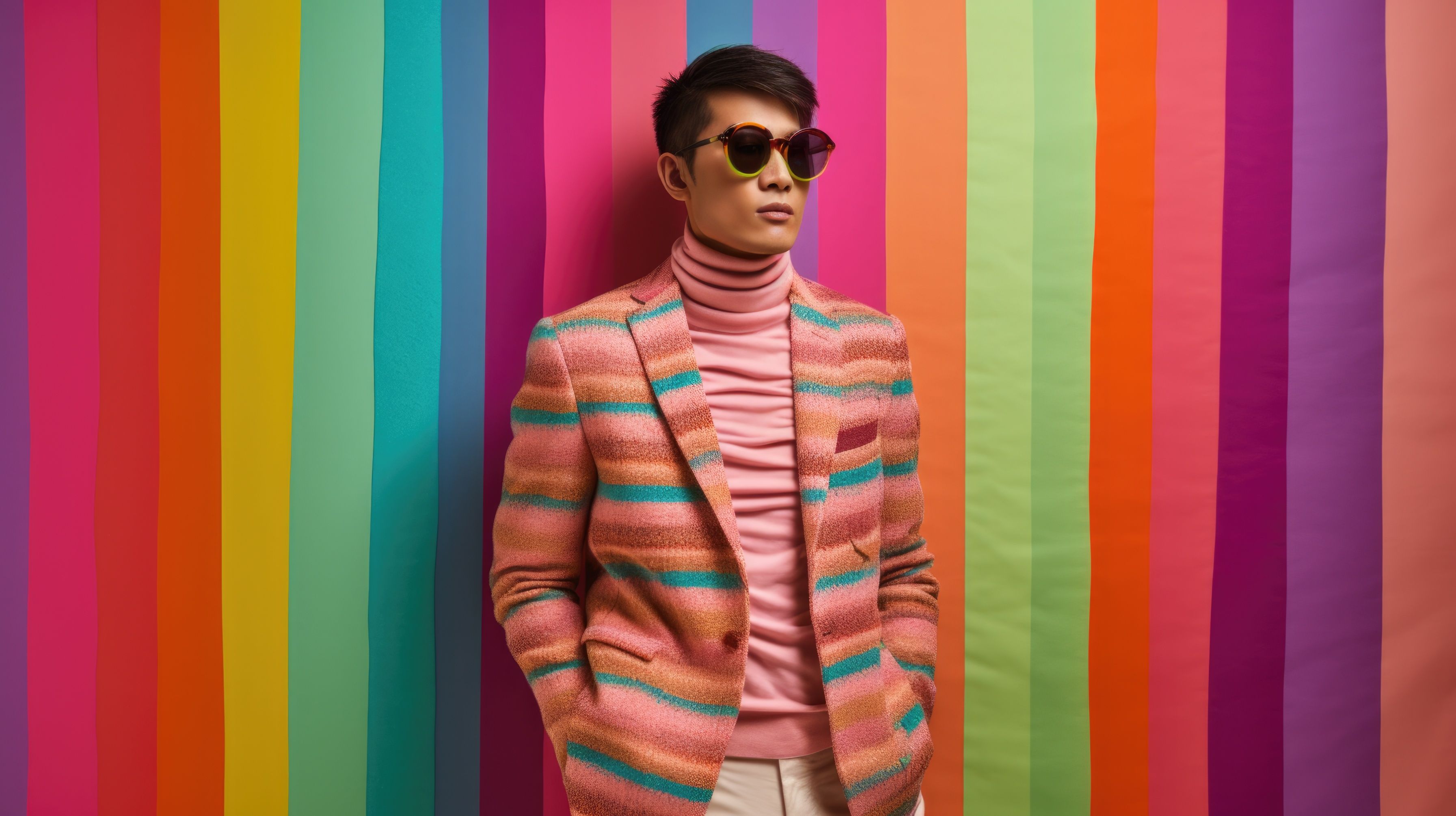
What Different Colors Typically Communicate?
While color meanings can vary slightly across cultures, certain psychological associations are widely recognized.
Black: Authority and Control
Black is one of the most powerful colors in fashion.
It represents:
- Authority
- Sophistication
- Control
It is often used in formal settings because it creates a sharp and minimal impression.
Black outfits tend to feel intentional. They remove distraction and focus attention on presence.
This is why black works well for:
- Formal events
- Professional environments
- Evening wear
At the same time, too much black can feel distant or unapproachable in certain settings. Balance matters.
White: Clarity and Simplicity
White signals:
- Freshness
- Cleanliness
- Simplicity
It creates a sense of ease and openness.
In fashion, white is often used to create a light and effortless look. It works especially well in warmer seasons and structured office environments where neatness is important.
White also reflects attention to detail. It is difficult to maintain, which subconsciously signals discipline.
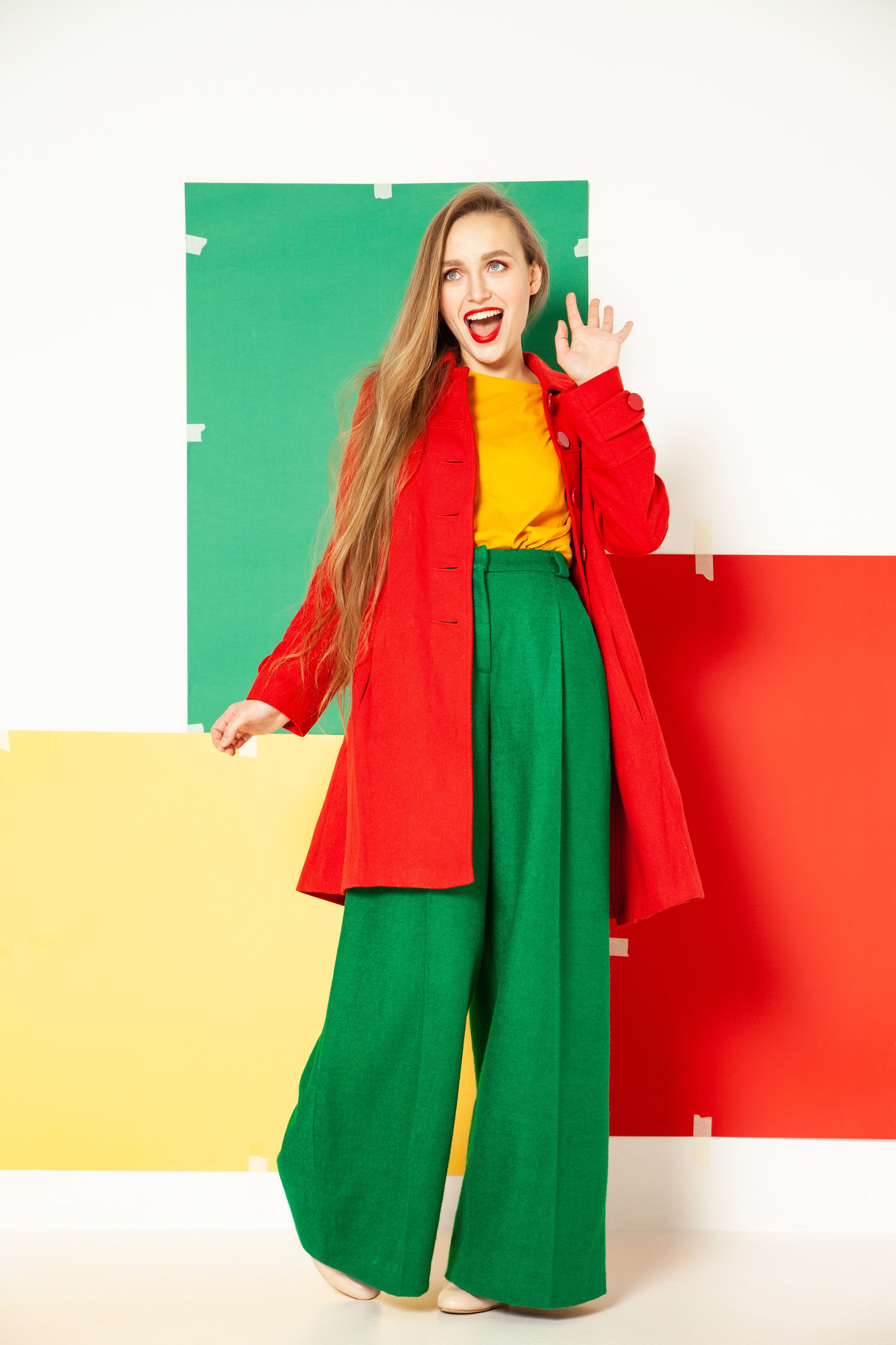
Red: Energy and Attention
Red is a high-impact color.
It communicates:
- Energy
- Passion
- Confidence
It draws attention immediately.
This is why red is often used when you want to stand out or lead.
However, context is critical.
In social settings, red feels bold and attractive.
In formal environments, it can feel overpowering if not styled carefully.
Blue: Trust and Stability
Blue is one of the most universally accepted colors.
It represents:
- Trust
- Calmness
- Reliability
This is why it is widely used in corporate settings.
Blue helps create a sense of stability. It feels safe and composed.
It works well for:
- Interviews
- Meetings
- Client interactions
Lighter blues feel approachable.
Darker blues feel authoritative.
Yellow: Optimism and Energy
Yellow reflects:
- Positivity
- Warmth
- Creativity
It is a mood-lifting color.
In fashion, yellow works best in controlled amounts. It can elevate a simple outfit and make it feel more vibrant.
Overuse can feel overwhelming. So, it is often used as an accent rather than a base.
Green: Balance and Ease
Green is associated with:
- Growth
- Balance
- Freshness
It feels grounding and easy on the eyes.
Green works well in casual and semi-formal outfits where you want to appear approachable and relaxed.
Earthy tones of green feel calm. Brighter greens feel energetic.
Pink: Soft Confidence
Pink represents:
- Empathy
- Softness
- Romance
Modern fashion has redefined pink.
It is no longer limited to delicate styling. It is now used to express confidence with a softer edge.
Muted pinks feel elegant.
Brighter pinks feel bold and expressive.
Grey: Subtle and Balanced
Grey is a neutral that communicates:
- Balance
- Neutrality
- Understatement
It is widely used in professional wardrobes.
Grey does not demand attention, but it supports structure.
It works well when paired with stronger colors, helping create a balanced look.
The Psychological Impact on the Wearer: Mood Based Dressing
Your internal state affects your external choices more than you realize.
But most people do not consciously map mood to color.
Typical Manual Process
You feel low energy
You default to neutral colors
You reinforce that same mood
Intelligent Process
The Glance Intelligent Shopping Agent interprets intent of the occasion such as:
- You need to feel more confident for the interview
- You want something calm but not dull for an evening walk
- You want to appear approachable for a club night
It then translates that into:
- Color selection
- Outfit combinations
- Visual presentation
For example:
- Low energy → introduces subtle brightness through accents
- High pressure → stabilizes with structured tones
- Social setting → balances expression with approachability
This is not about suggesting a color. It is about shaping how you show up.
Color Psychology as Per Different Context
Color psychology is not fixed. It adapts based on context.
Occasion
The same color can send different signals depending on where you wear it.
Red at a party feels exciting.
Red in a boardroom can feel intense.
Cultural Meaning
Color interpretation varies across regions.
White may represent purity in some cultures.
In others, it is linked to mourning.
Understanding context helps avoid miscommunication.
Color Combinations
Colors rarely work in isolation.
A single color changes meaning when paired with another.
- Black with white feels classic
- Red with black feels bold
- Blue with grey feels professional
Styling is about combinations, not just individual colors.
Personal Identity
Confidence plays a major role.
If you feel comfortable in a color, it will reflect in how you carry yourself.
This often overrides theoretical meanings.
How to Use Color Psychology Strategically
Instead of following fixed rules, use color as a tool.
For Professional Settings
Choose colors that build trust and clarity.
- Blue for reliability
- Grey for balance
- White for neatness
These combinations work well for meetings and interviews.
For Social Events
Introduce stronger colors.
- Red for attention
- Pink for expression
- Yellow for vibrancy
This helps create presence without saying a word.
For Travel and Casual Settings
Focus on ease and comfort.
- Greens for calmness
- Whites for freshness
- Soft tones for relaxed styling
These colors align with slower, more relaxed environments.
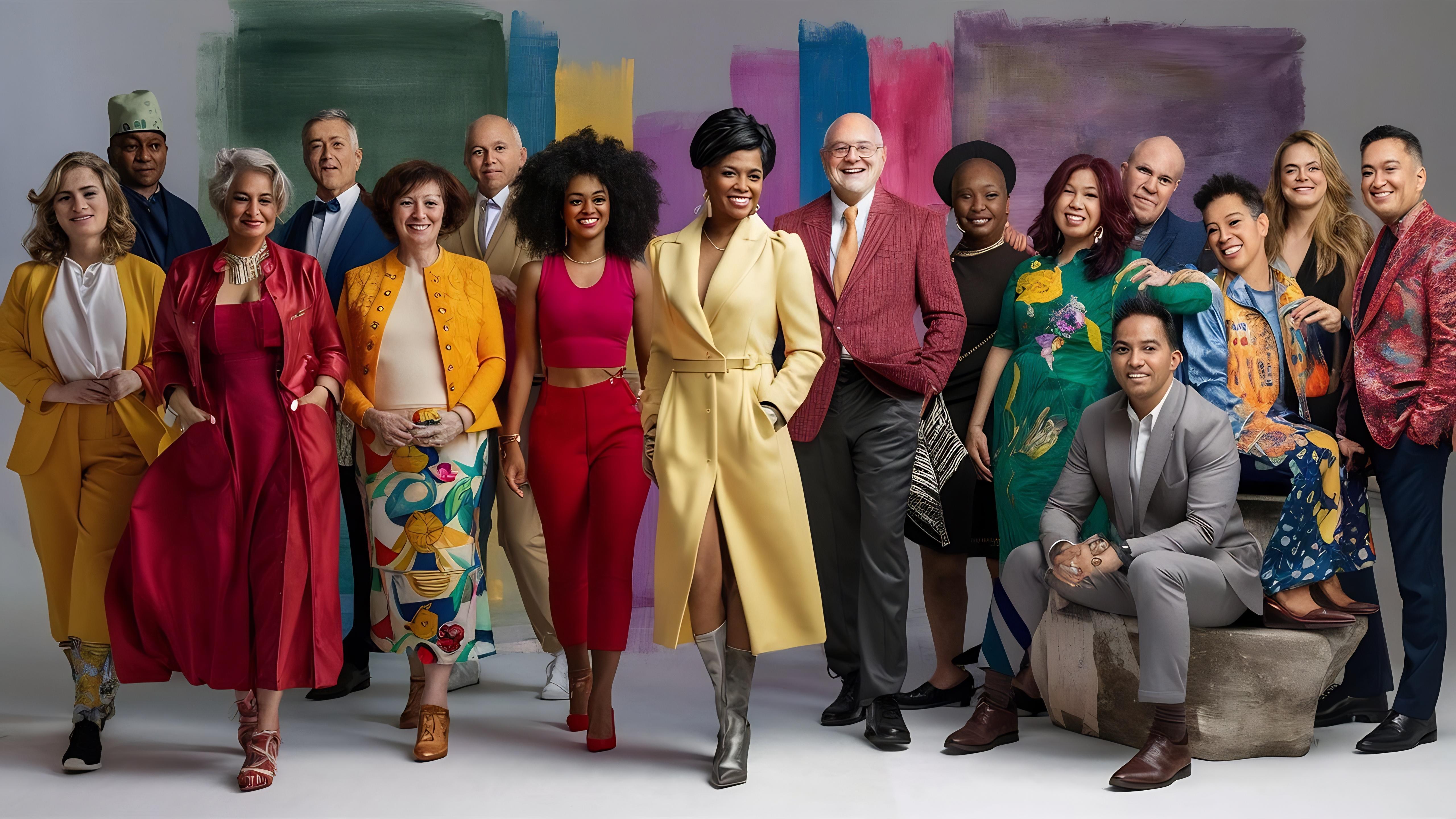
Understanding Skin Tone and Undertones to Understand Color Psychology
Color psychology becomes more effective when it aligns with your natural tone.
Skin Tone Categories
In the US, skin tones are often grouped into:
- Fair
- Light
- Medium
- Olive
- Deep
Each interacts differently with color.
Undertones Matter More
Undertones define how colors look on your skin.
There are three main types:
Warm undertones
- Yellow or golden base
- Works well with earthy colors like orange, olive, mustard
Cool undertones
- Pink or blue base
- Looks better with jewel tones like blue, purple, emerald
Neutral undertones
- Mix of both
- Can carry most colors well
Why This Matters
The same color can look different on different people.
Choosing shades that align with your undertone enhances:
- Skin appearance
- Overall outfit balance
- Visual harmony
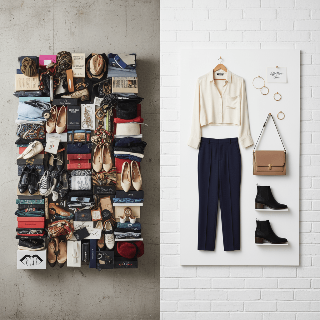
Color Pairing: Where Most Decisions Fail
Colors rarely work alone. They work in combinations.
Most fashion advice stops at:
- Pair black with white
- Use neutrals with accents
But real wardrobes are not curated that neatly.
Common Problems
- Limited combinations from existing wardrobe
- Repetition of safe pairings
- Mismatch between colors and personal tone
What Intelligent Pairing Looks Like
The Glance Intelligent Shopping Agent:
- Analyzes what you already engage with
- Understands what combinations you prefer
- Builds new combinations dynamically
Instead of:
Choosing one color
You get:
Complete outfits with balanced color relationships
This moves you from:
What should I wear
To:
Here is what works right now
Why Two People Wearing the Same Color Look Different
Color psychology becomes meaningful only when it aligns with the individual.
The Limitation of Generic Advice
Most guides categorize:
- Fair
- Medium
- Deep
But this is surface level.
What Actually Matters
Undertones
Facial structure
Contrast levels
Overall presence
Intelligent Interpretation
The Glance Intelligent Shopping Agent uses visual cues to infer:
- Skin tone
- Undertones
- Visual harmony
It does not rely on static charts. It adapts recommendations based on how colors interact with you specifically.
This is the shift from:
General advice
To:
Personal visual intelligence
From Outfit Selection to Decision Delegation
Traditionally, styling is effort driven.
You:
- Search for ideas
- Compare options
- Test combinations
- Make a final decision
This process is time consuming and inconsistent.
With an Intelligent Shopping Agent
You shift from doing to delegating.
You express intent:
- Outfit for a client meeting
- Something confident but not loud
- Casual but structured for travel
The system:
- Interprets your intent
- Applies color psychology
- Considers context and personal attributes
- Generates complete outfits
You receive:
- Ready to wear combinations
- Visually coherent looks
- Decisions that align with your situation
This is not a recommendation. This is execution.
Wardrobe Intelligence: Beyond Static Clothing
A traditional wardrobe is static.
You own pieces. You combine them manually.
An intelligent wardrobe evolves.
Without Intelligence
- Repetition of known outfits
- Underutilized pieces
- Limited combinations
With the Glance Intelligent Shopping Agent
- Learns from what you engage with
- Understands what you ignore
- Identifies patterns in your choices
It evolves your wardrobe into:
- Context aware
- Combination ready
- Decision efficient
Every interaction improves future suggestions.
This creates a feedback loop where your wardrobe becomes easier to use over time.
Conclusion
Understanding color psychology gives you awareness.
But awareness alone does not simplify decisions.
The real challenge is applying that knowledge consistently across changing situations, moods, and environments.
That is where most people struggle.
And that is where intelligent systems redefine the experience.
With the Glance Intelligent Shopping Agent, color is no longer something you interpret manually.
It becomes part of a system that understands your intent, adapts to your context, and delivers outcomes that feel natural and aligned.
You are no longer deciding what to wear based on fragmented rules.
You are stepping into a version of yourself that is already optimized for the moment.
That is the shift from fashion knowledge to decision intelligence.
FAQs Related to Fashion Color Psychology Guide
What is Gen Z's favorite color?
Gen Z does not stick to a single favorite color. Their preference shifts based on mood, identity, and trends. However, bold and expressive shades like bright green, lavender, electric blue, and hot pink are widely popular. At the same time, muted tones like beige, off-white, and earthy neutrals are also trending for everyday wear. The key pattern is flexibility. Gen Z uses color as a form of self-expression rather than following fixed choices.
Which colors look classy?
Classy colors are usually timeless, balanced, and easy to style. Shades like black, white, navy blue, beige, and grey are considered classic because they create a clean and polished look. Deep tones such as burgundy, emerald green, and charcoal also add sophistication without feeling loud. These colors work well in both formal and semi-formal settings because they look refined and do not go out of style easily.
What colors make you look younger?
Colors that make you look younger are typically fresh, soft, and light-reflecting. Shades like pastel pink, soft blue, mint green, peach, and lavender can brighten the face and create a more youthful appearance. Avoid overly dull or dark tones close to the face, as they can make the skin look tired. The right shade depends on your undertone, but lighter and more vibrant hues generally help create a fresher look.
What colors will be trending in 2026?
Fashion color trends for 2026 are expected to balance bold expression with calm neutrals. Bright tones like digital blue, citrus orange, and vivid green will stand out, while soft neutrals such as sand, cream, and muted olive will continue to dominate everyday styling. There is also a strong shift toward nature-inspired palettes and wearable pastels. The trend focuses on colors that feel expressive but still practical across different settings.
What color is replacing gray?
Grey is not disappearing, but it is being complemented and sometimes replaced by warmer, more expressive neutrals. Shades like beige, taupe, soft brown, and muted olive are becoming more popular because they feel less cold and more adaptable. These colors offer the same versatility as grey but add warmth and depth to outfits, making them a preferred choice in modern wardrobes.
Download the Glance app now


