

Decoding Fashion Color Science: How Shades Define Aesthetics
Fashion changes fast, but color is the quiet force that never stops shaping what we wear and how we feel. Even before silhouette, fabric, or trend cycles, your brain makes a snap judgment based on color alone. That micro-moment—milliseconds long—already sets the emotional tone of your outfit, your aesthetic, and often your self-perception for the day.
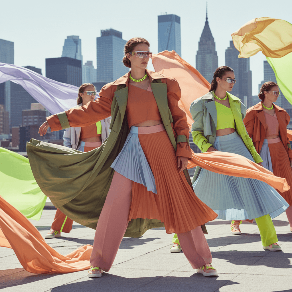
Fashion color science sits at a fascinating crossroads: psychology, neurology, cultural storytelling and pure personal preference. And from the rise of warm, muted “brown-beige” aesthetics to dopamine brights, Gen Z minimalism and TikTok-driven color moods, we’re living in the most color-aware era fashion has ever seen.
In this blog, we’ll talk about how colors affect us, why certain aesthetics dominate, and how the palette you choose subtly changes the way you carry yourself.
What is Fashion Color Science?
Color is the real architect of fashion. Think of the last time you stared at your closet and instinctively reached for black because it “felt right.” Or when a bright green sweater made you feel unexpectedly alive. That wasn’t random. Color plays an invisible but powerful role in:
• emotional regulation
• self-confidence
• sensory comfort
• identity expression
• personal aesthetic building
• trend adoption through social media
Color decisions often happen faster than conscious thought. Fashion psychologists argue that up to 90% of initial impression is based on color before any other design element kicks in. It's not just “I like this shade”—your nervous system is reacting to it.
As new aesthetics like latte dressing, soft brown minimalism, muted warm palettes, and beige-based luxury moods take over Instagram and TikTok, there’s a deeper story behind why these shades suddenly dominate.
Why Colors Affect Us Differently?
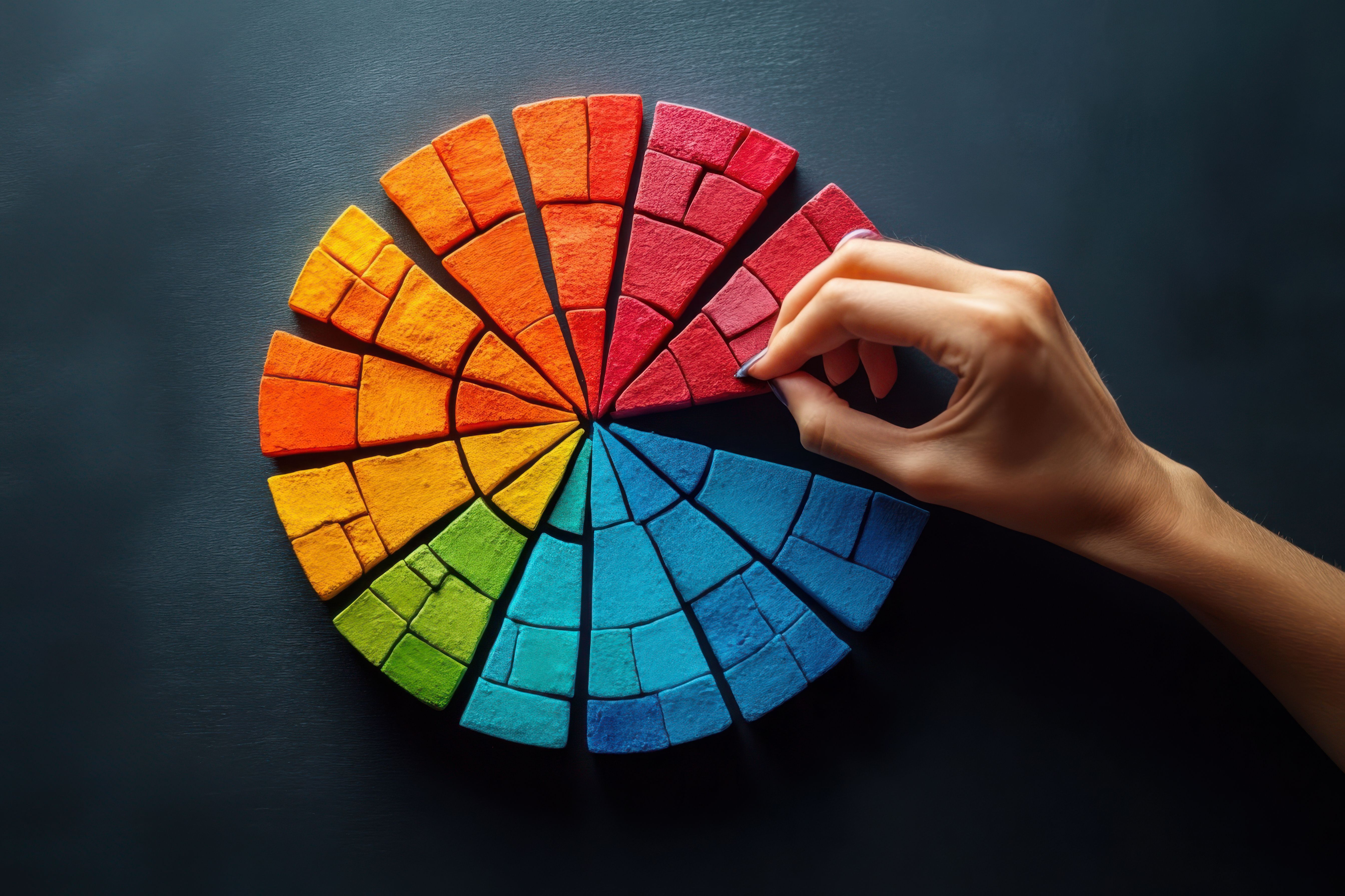
The science of how colors work in fashion involves two major layers:
1. The Psychological Layer
Color can trigger emotional and cognitive responses. For example:
• Blue calms the brain and increases focus.
• Red elevates heart rate and boosts alertness.
• Brown and beige create psychological grounding and safety.
• Yellow activates optimism—but can also cause overstimulation.
Your fashion choices become small acts of emotional self-management.
2. The Cultural Layer
The fashion color scene also carries cultural stories. Beige can signal quiet luxury in one context, but simplicity or neutrality in another. Black can mean elegance, rebellion, or solemnity depending on the cultural lens. Fashion color science works because both the body and society respond to color cues.
When both layers combine, you get a powerful fashion language.
Did you know? In the USA apparel market, neutrals including black, white and gray remain the top preferences, while jewel tones such as magenta, teal and emerald along with primary colours like red, yellow and blue continue to be widely popular.
The New Colour Era: Aesthetics Everywhere

Walk through any Pinterest board right now and you’ll see a wave of beige, taupe, camel, mocha, hazelnut, and soft browns. They dominate feeds, wardrobes, influencer styling and even luxury campaigns.
Why? Let’s break down the psychology and aesthetic appeal.
1. Brown = grounding
Brown mimics natural textures—wood, earth, clay. Studies link these tones to feelings of:
• security
• warmth
• dependability
• sensory softness
In a world full of digital noise and overstimulation, brown feels like a breath out.
2. Beige = emotional neutrality
Beige is a “safe” color—quiet, soft, and non-intrusive. That neutrality creates space for expression without demanding attention.
This is why minimalism and beige often go hand in hand.
3. Warm neutrals look good on most undertones
Warm hues complement a broader range of skin tones than stark black-and-white extremes. Gen Z’s push toward inclusivity and diverse representation amplifies this effect. As the community shifted toward celebrating real skin tones, warm neutrals became a natural extension.
4. The rise of Quiet Luxury
TikTok exploded with “Old Money,” “Quiet Luxury,” and “Clean Girl” aesthetics. All of them rely heavily on warm neutral palettes. Beige became the visual code for sophistication without shouting.
Color and the Nervous System: How Fashion Color Science Changes Mood

Fashion color science taps into neurological responses. Here’s how certain shades interact with your mind and body:
Red: activation and boldness
Red increases heart rate and heightens awareness. People wearing red are often perceived as more assertive. It’s the shade of confidence and attention.
Blue: stability and clarity
Blue lowers stress markers and supports cognitive processing. It’s why many office dress codes historically leaned toward the navy.
Green: balance and renewal
Green connects with nature and stabilizes the visual system. It reduces fatigue and evokes harmony, making it a powerful color for days you need grounding.
Yellow: joy with a side of chaos
Yellow activates creativity and optimism, but too much can overstimulate the mind. In fashion, it’s best used in accents.
Black: power and simplicity
Black is psychologically linked to authority and structure. It sharpens silhouette and hides sensory elements, making it a comfort color for many.
Brown: comfort and belonging
Brown tones reduce anxiety responses and promote emotional warmth. This is key to the recent boom in brown-based aesthetics.
The Future: AI and Personalized Color Science
With AI-based outfit tools rising, fashion color science is becoming hyper-personalized. Algorithms can now analyze:
• your undertone
• your skin’s natural temperature
• your contrast level
• your comfort-based color choices
• colors that match your lifestyle and sensory needs
This helps you build personalized shade matching outfits. Imagine a wardrobe app that tells you, “This shade of muted rose increases your calm on stressful days” or “Taupe suits your natural complexion better than beige.”
AI is turning fashion color science into a daily companion rather than an abstract concept.
How to Build Your Personal Color Identity

You don’t need a degree in fashion psychology to understand what colors work for you. These principles help decode your palette and allows you design personalized shade matching outfits:
1. Check your undertone
Cool undertones glow in blues, purples, emeralds.
Warm undertones shine in browns, oranges, olive greens.
Neutral undertones can play with both.
2. Observe your emotional patterns
• What color do you wear when anxious?
• What color gives you confidence?
• What shade feels “too loud”?
Self-auditing is powerful.
3. Consider your lifestyle
If your days involve high stimulation, grounding warm neutrals may help regulate sensory load. If creativity is your world, brighter tones might energize your work.
4. Leverage Technology
Glance, the intelligent shopping agent, helps you move beyond guessing. Create your AI twin and instantly preview how colours, fits, and full outfits look on your body before you buy. It turns inspiration into accurate, personal clarity.
Conclusion
Fashion color science isn’t about rules; it’s about awareness. Color speaks before fabric, trend, or silhouette does. It affects mood, communicates identity, and constructs entire aesthetics with a single shade shift.
As warm browns, latte tones and soft beiges take over modern wardrobes, they reflect our cultural craving for calm and grounding. And as social media pushes new color moods into the spotlight, we continue refining how color shapes our sense of self.
Fashion isn’t just what you wear. It’s how you feel in what you wear—and color is the hidden chemistry behind it.
The more you understand the color science behind your palette, the more intentional, expressive and emotionally aligned your personalized shade matching style becomes.
FAQs Related to Fashion Color Science
1. How does cultural color memory influence how we perceive modern fashion aesthetics?
Cultural color memory shapes emotional responses built from traditions, media, and environment. It influences why beige feels calming to some and dull to others, affecting how global audiences read modern brown and neutral aesthetics.
2. Why do colours look different on screens versus real life, and how does that affect fashion choices?
Screens use RGB light while garments use pigment, creating shifts in warmth, saturation, and depth. This mismatch changes expectations, often causing disappointment or returns. Brands now use calibrated photography to minimize discrepancies.
3. How does metamerism impact how fashion colours appear under different lighting conditions?
Metamerism causes colours to change appearance under sunlight, LED, or fluorescent light. Neutral shades like beige or taupe shift most. Designers test shades under multiple lighting environments to ensure consistent real world perception.
4. What role do undertones play in AI colour recommendation engines?
AI analyses undertones such as olive, rose, or golden. These refine recommendations for skin tone, preferences, and aesthetics. Undertone mapping improves accuracy, especially for nuanced palettes like browncore and minimal neutral trends.
5. How is colour science evolving for digital fashion and virtual try ons?
Emerging tech like spectral rendering simulates real light interaction on fabrics. This boosts accuracy in digital garments, improving user trust and reducing return rates. It aims to replicate true colour behaviour online.
Download the Glance app now


